Decorist Sofa Quiz
Services
UX/UI Design, Responsive Web
About
Decorist is an online interior design company that matches you with a professional interior designer to design any room in your home in your style and budget, all on their online platform.
Bed Bath & Beyond acquired Decorist in 2016, adding to their portfolio of services offered while gaining a business partner with design expertise needed to help develop their new and improved home furnishings category.
Challenge
There are a few steps to get you to your dream room when working with your interior designer on Decorist. It’s at the end of this process that the customer purchases items from their completed design. Decorist customers are typically very happy with their designs and feel confident in the design process to purchase their designer-recommended items on our platform.
The challenge is that there’s a much higher business effort to first convert a customer to purchase a project and get them through to the end to make a furniture purchase. Decorist wanted to introduce an additional ecommerce experience that was more traditional, but unique in that it would leverage its designer expertise to help guide the user to purchase. This could be a low-barrier way to acquire new users and retain existing users in between design projects.
Solution
The business goal was obviously to increase our revenue, however we wanted to first build an MVP using one strong furniture category so that we could have some learnings before building out the entire ecommerce platform.
Our team did a lot of research into our site analytics, SEO, and customer surveys to select Sofas as our inaugural category. The living room is our most popular room and we’ve seen positive trends of customers purchasing sofas through our platform. Additionally, SEO traffic for sofas is high and customers seem to need design advice when choosing the right sofa since it’s such a big purchase and focal point of the room (both aesthetically and functionally).
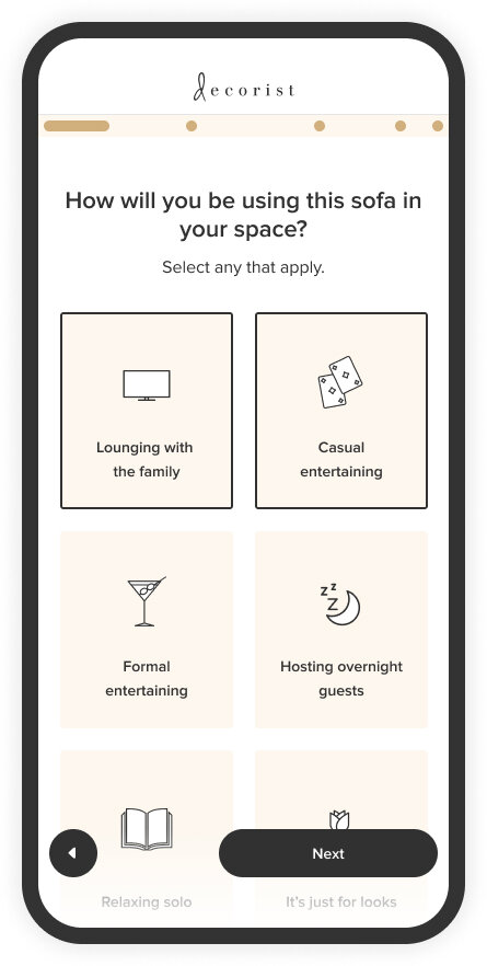
As a team, we decided that a quiz to find your perfect sofa would be an engaging approach for acquiring new customers, marketing to our existing customers, and validating our design expertise by giving customers personalized recommendations.

Initial Research
I started by digging into everything “sofa” to help inform and inspire me on ways to present sofas from our unique perspective. This included many areas of research:
Furniture ecommerce sites and sofa product details
Blogs and design sites featuring sofa styles and comfort tips
Surveying and talking with our interior designers about how they go about sourcing sofas for a client and what client’s preferences or concerns are when it comes to sofas
Customer surveys specific to purchasing a sofa
Our project lead worked with interior designers on fine-tuning the assortment of designer-recommended sofas we wanted to include. These would be the highest-quality, most comfortable sofas across every shape and style from our most trusted brands.

Design Approach
I wanted the quiz to feel relevant, fun, and personalized along the way. I also wanted to make sure that the user felt guided by a designer almost as if they were working with one on a project, to give them confidence in the sofa recommendations they would receive.
I started mapping out the questions and logic in a spreadsheet, while also thinking about the UX of the quiz itself and how a user would interact with it. The content of the quiz was a group effort between myself, the project leads, and interior designers with many iterations and test run-throughs.
Iterative Approach
We took an iterative approach by doing a soft launch of a simple PLP with a smaller sofa assortment and a new sofa PDP with integrated checkout. This allowed us to get the assortment out to our users sooner so we could gather feedback on the sofas and the experience while we worked on the Sofa Quiz.
Final Design
After a few rounds of feedback on quiz content and logic, I started putting everything together into the framework of a quiz. Since this was a new product for our business, I wanted it to use our design system in a unique way so that this experience could take on a look and feel of its own going forward.
I used a secondary color in the brand palette, Cream, as a primary color for the new quiz experience which marketing named Sofa Scout. I also created a set of isometric sofa icons to use through the quiz, results pages, emails, and marketing. These outlined icons fit into our brand’s iconography and helped define our sofa type recommendations.
Since there were multiple sections to the quiz, I had decided in the wireframes that I wanted the progress bar to show those sections so users had complete context as to their progress and even progress within each section.
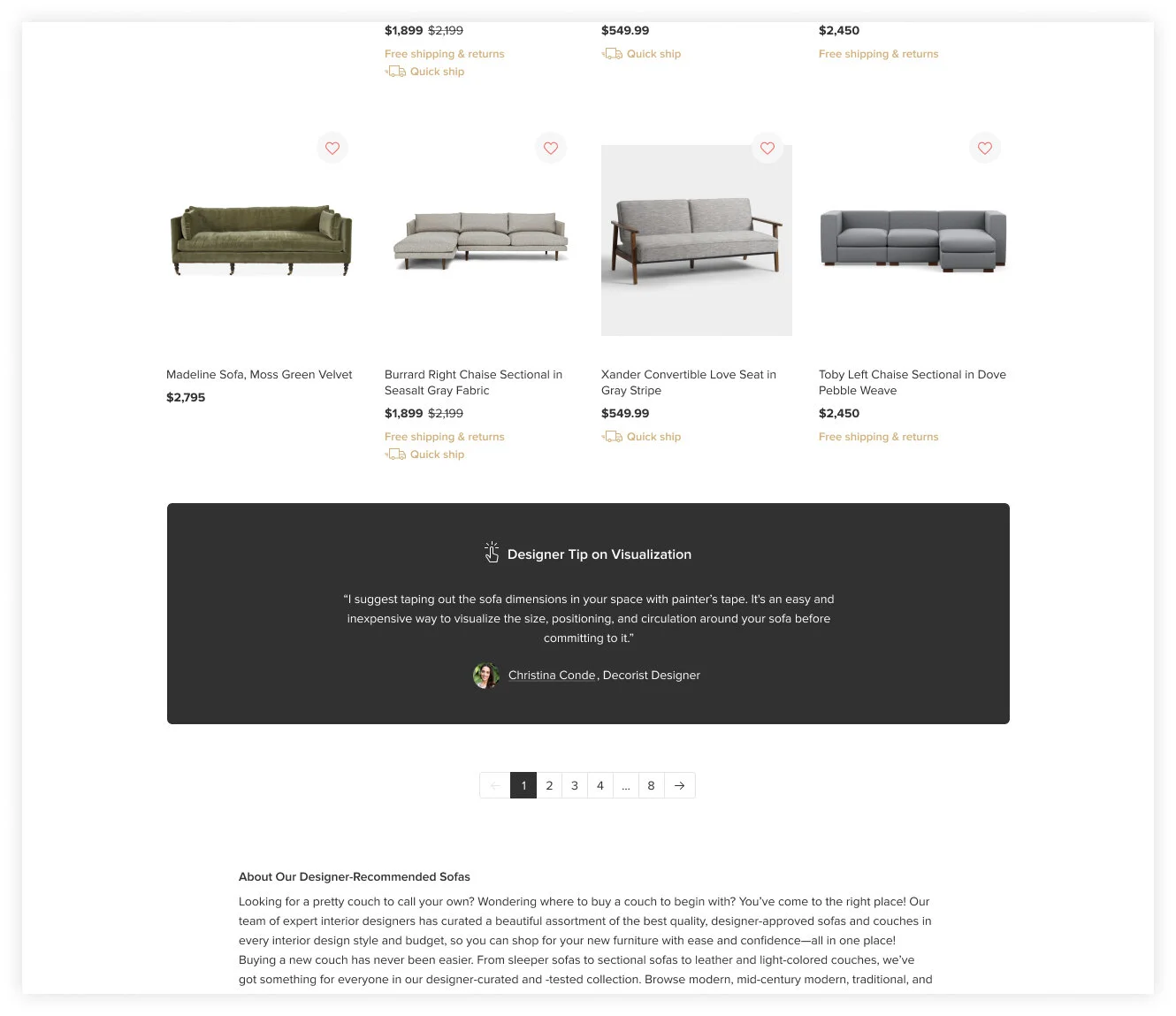
I worked to fine-tune the content by working with our copywriter for tone/voice and our interior designers to get their tips which we would add at key moments within the quiz as well as sprinkle throughout the PLPs for users while browsing.
I created isometric icons to represent the different sofa types and also worked on pulling together the rest of the icon set to use throughout the quiz. The icons were a way to quickly communicate to the user throughout and to give it a fun and friendly feel overall.
I also designed a robust PDP that included sofa-specific sections relevant to comfort and sit. In our research, this was a very important aspect to get right for user’s making an online sofa purchase. There are many opportunities to optimize this with even more descriptions, visuals, and video.
The PLP was designed to be very simple and straightforward for the MVP since this page would change drastically as we start adding more categories and become more of a shoppable landing page for furniture and home decor. We wanted to drive people to take the quiz first while also allowing users to browse, filter, and sort our products on their own.
That first sofa sale immediately helped us validate the opportunity we had uncovered and invested in building out. We initially did a soft launch, where we continued to get feedback on the product and the sofa assortment so we could fine-tune the experience and make sure users were getting results they were happy with. We included a customer feedback form on the results page to help gather this feedback.


